Case Study — Branding · Logo · Packaging
Orchard Elegance
When Orchard Elegance approached Million Tech, they brought a clear ambition: launch a women’s nightwear brand with a visual identity as refined as the products themselves. Translating that concept into a commercially viable, legally protectable, and technically reproducible identity was another matter entirely.
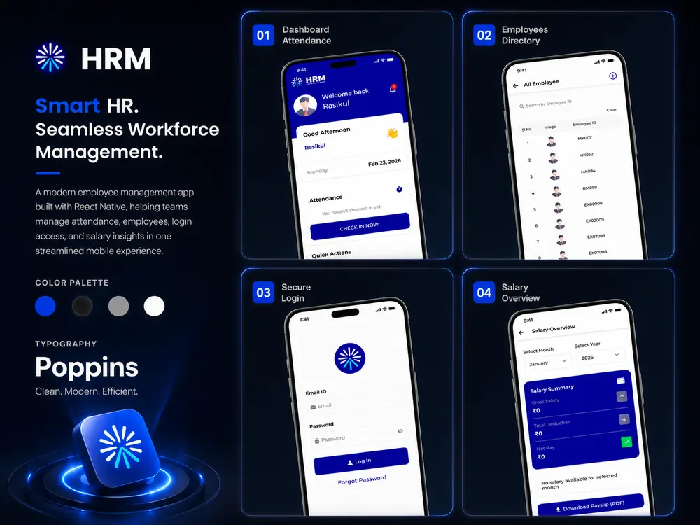
HRM APP
The Challenge
Logo Design
Orchid-inspired logos are not uncommon. The risk of producing something generic, derivative, or legally vulnerable was very real. The design also had to communicate that this was a women’s brand unmistakably — not through clichéd markers, but through something more considered.
Multi-Format Performance
The logo needed to perform across embroidered stitching on fabric, sublimation printing, and white paper packaging — each with its own constraints around color, resolution, and background handling. A logo that falls apart in production is not a solution.
Color Consistency
Multiple printing techniques were in play simultaneously. Maintaining color fidelity across all these methods — ensuring the brand’s signature hues read consistently whether heat-transferred or offset-printed — was a central technical challenge.
Cost-Conscious Quality
The standard answer to color consistency — Pantone specification — guarantees accuracy but at significant ongoing cost, especially for a brand in its launch phase. A smarter approach was needed to protect both the design and the client’s margins.
The Solution
01
Two Weeks of Research Before a
Single Line Was Drawn
Million Tech conducted two weeks of intensive research into existing orchid and flower-based logos across the fashion, beauty, and lifestyle sectors. The goal was twofold: to understand the visual conventions of the category well enough to subvert them, and to ensure the design would be sufficiently original to support trademark and copyright protection.
This research phase is often treated as a formality. Here, it was treated as strategy — shaping the creative direction from the ground up and ensuring every decision was made with full awareness of the competitive landscape.
03
The Hidden Silhouette: Depth
Through Negative Space
Within the orchid design, negative space was used to embed a woman’s silhouette. The figure does not announce itself — it is discovered. This technique served a precise strategic purpose. Orchard Elegance is a women’s brand, and the logo needed to communicate that without resorting to stereotyped visual shorthand.
The hidden silhouette does this quietly, embedding the brand’s identity in the very structure of the mark. For those who notice it, it creates a moment of recognition. For those who don’t, the design still communicates femininity through its form and proportion. Either way, the message lands.
The logo needed to perform across embroidered stitching on fabric, sublimation printing, and white paper packaging — each with its own constraints around color, resolution, and background handling. A logo that falls apart in production is not a solution.
02
The Orchid's Architecture as a
Design System
The orchid’s natural structure became the foundation of the visual identity. The five-petal formation, combined with the covered filament — the distinctive central element of the orchid flower — was used as the primary design motif. Rather than stylizing into abstraction, the design retained botanical specificity. This precision gave the logo a sense of authenticity that generic floral marks lack, while the considered execution kept it from feeling illustrative or overly literal.
04
Solving Color Consistency —
Without Pantone
By combining CMYK and RGB color techniques calibrated specifically for each production method, the team achieved consistent, accurate color reproduction across all formats — embroidered stitching, sublimation printing, and paper-based packaging — without Pantone specification. This was not a shortcut. It required deep familiarity with how different printing technologies interpret and render color, and the ability to translate that knowledge into production-ready files any manufacturer could use.
The practical outcome was a color system that preserved the brand’s signature look across every touchpoint while meaningfully reducing ongoing printing costs.
“A flower with a name attached is not a brand identity. The design had to carry the weight of the brand’s positioning on its own.”
03 — Results
From Design Approval
to Market Traction
700–800
100%
Orchard Elegance launched with a brand identity that passed the most important tests: the client approved the designs, and production quality across all formats met expectations. The color system worked as intended — no unexpected drift, no costly reprints.
The commercial results followed quickly. Within two months of product launch, Orchard Elegance achieved between 700 and 800 sales — strong early traction for a new brand entering a competitive category. A coherent and professional brand identity is the foundation on which consumer trust is built. In a crowded market, how a brand presents itself determines whether a first-time buyer becomes a returning customer.
Reflection
The Orchard Elegance project illustrates something easy to overlook in design work: creative decisions and technical decisions are not separate concerns. The hidden silhouette is a creative idea, but it only works because it was designed with the constraints of embroidery and sublimation printing in mind. The color system is a technical solution, but it was built to serve a creative brief about boldness and consistency.
Beginning with research, anchoring design in actual production requirements, and treating every decision as both a creative and a practical one — this is what allowed Orchard Elegance to launch with an identity that performs as well in the real world as it does in the concept presentation.